pomma
A behavioural system designed to help women understand desire through guided exploration, contextual recommendations and reflective feedback loops.


Pomma is an erotic wellness platform designed to help women reconnect with their sexuality through exploration, reflection and personalised guidance.
Built from the ground up, the product combines educational content, behavioural insights and contextual recommendations to support long-term sexual wellbeing rather than short-term consumption.
As co-founder and lead product designer, I was responsible for the product strategy, recommendation framework, content architecture, user experience, visual identity and iOS design system.
the opportunity
Sexual wellbeing is often treated as something separate from the rest of our health.
While many women actively invest in areas such as physical fitness, nutrition or mental wellbeing, desire is rarely approached with the same level of intention and care. After analysing the existing landscape, a recurring pattern emerged. Most products positioned themselves either as educational wellness tools or as platforms for erotic entertainment, leaving little room for experiences that combined both perspectives.
This creates a gap between wellbeing and desire, forcing users to choose between two experiences that are often deeply connected.
Pomma was built around a different idea.
Rather than treating desire as something to optimise or consume, the goal was to create a space where users could explore it more intentionally. One that embraced pleasure without feeling explicit, and supported self-discovery without feeling clinical.
This principle became the foundation for every decision that followed, shaping the product’s positioning, visual identity and overall experience.
Designing for Discretion
Creating a product around desire introduced a unique design challenge.
Many products in the category communicate through either wellness or eroticism. Some adopt the visual language of health and self-improvement, while others lean into sensuality and fantasy. Neither felt right for the experience we wanted to create.
The goal was to design something that felt intimate without being explicit, personal without feeling secretive, and premium without becoming intimidating.
This thinking shaped every aspect of the visual identity. Pomma takes inspiration from the symbolism of the forbidden fruit, reinterpreted through a simple apple-inspired icon that subtly reveals a heart when rotated. The result feels familiar and approachable while retaining a layer of meaning connected to desire and self-care.
The same principles extended into the colour system. Rather than relying on highly saturated palettes commonly associated with either wellness or erotic content, a softer visual language was developed to create a calmer and more welcoming experience. Colour also became a functional part of the product, helping users understand different levels of content intensity at a glance without overwhelming the interface.
Together, these decisions established a visual foundation that felt private, approachable and naturally integrated into the broader wellbeing ecosystem.


Helping users navigate desire
Unlike music, movies or podcasts, desire is deeply personal and highly contextual.
What feels appealing in one moment may feel completely different in another, influenced by factors such as mood, energy, emotional state or available time. This makes traditional content categorisation less effective than in many other media products.
Early content explorations revealed that users were often not looking for a specific story or fantasy. More commonly, they were trying to find something that matched how they felt in a particular moment. This led to a broader content architecture built around different needs and intentions. Some users arrive looking for fantasy and immersion, while others seek relaxation, self-connection or simply a space to explore their curiosity. Supporting these different moments required a broader content architecture, bringing together multiple formats that work together as part of a wider wellbeing journey.
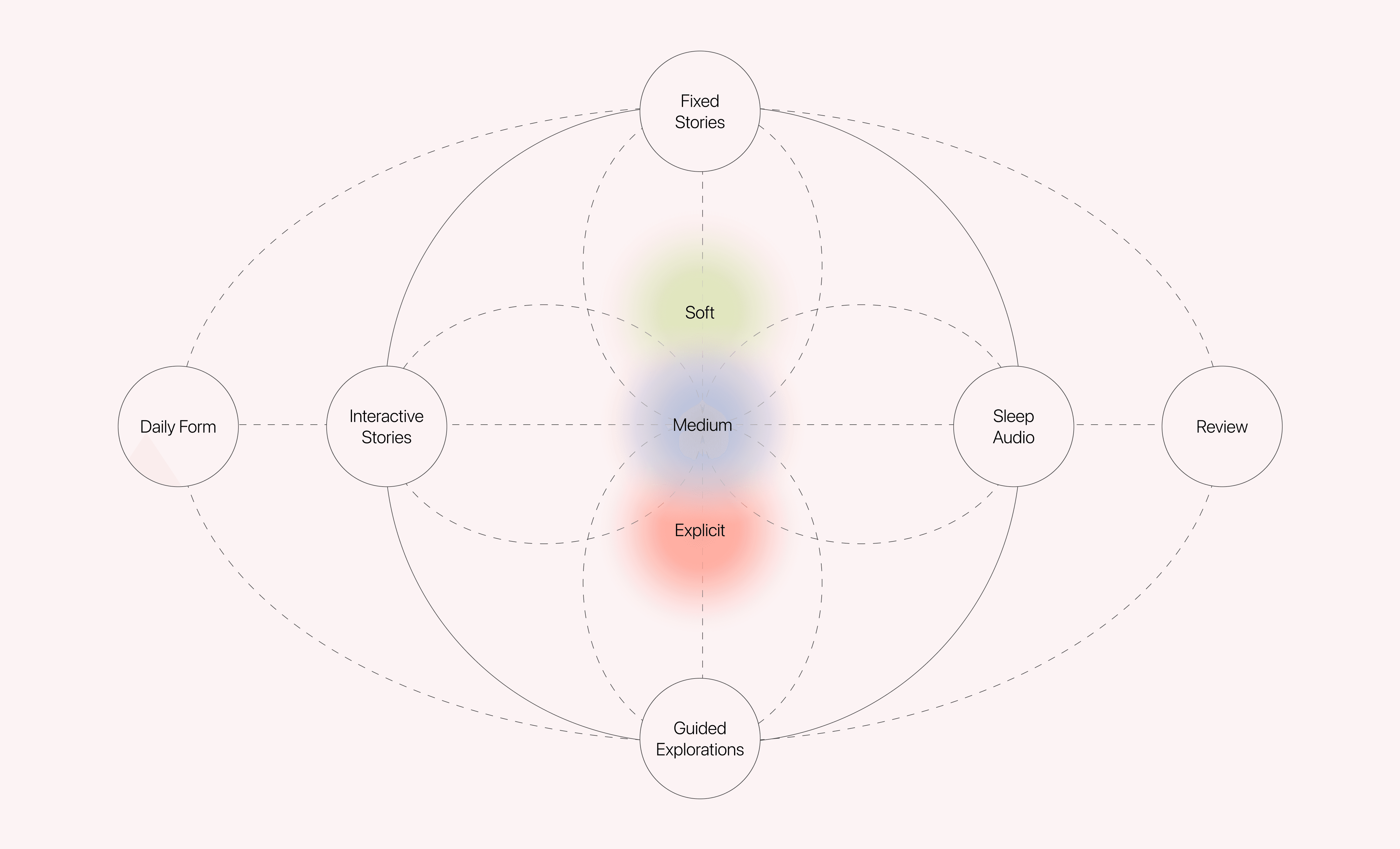
However, defining the content was only part of the challenge. Users also needed a way to discover experiences that matched how they felt in a particular moment.
Traditional categorisation systems proved too rigid for a product centred around desire. While genres helped organise content, they provided little support for users who often knew how they felt, but not necessarily what they wanted. Instead of relying primarily on genres or predefined categories, the experience was designed around context, mood and personal preference. This approach helps users focus less on choosing from an overwhelming catalogue and more on finding experiences that feel relevant to their current state.
One challenge remained: helping users understand what a piece of content might feel like before engaging with it. To address this, an intensity system was introduced across the product. Each piece of content is associated with a distinct intensity level, helping users quickly understand what to expect before engaging with it. Colour became an important part of this system, creating an intuitive visual language that supports decision-making without overwhelming the experience.
By combining content architecture, contextual discovery and intensity-based navigation, the product encourages a more intentional relationship with desire. Rather than simply helping users find something to consume, it helps them better understand what resonates with them and why.


Adapting the experience to the user
One of the challenges we identified was that sexual wellbeing is often treated as something that requires dedicated time and attention, resources many women feel they have very little of.
To make exploration more accessible, we designed different ways of engaging with content that can adapt to different moods, routines and contexts. Whether users prefer reading, listening, or winding down before sleep, the experience can be tailored to fit their needs.
Features such as audio playback, listening controls and sleep timers help transform content from something that demands attention into something that can naturally integrate into existing self care rituals.
Rather than asking users to make time for sexual wellbeing, we focused on helping sexual wellbeing fit more naturally into their lives.

Reflection as a Feature
Desire is rarely static.
It fluctuates based on mood, energy, relationships, stress, routines and countless other factors. Yet most products only focus on the moment of consumption, offering little support for understanding what happens across days, weeks or months.
Pomma was designed to help users move beyond individual sessions and recognise patterns over time.
One of the challenges was encouraging reflection without turning the experience into a tracking tool. Daily check-ins create lightweight opportunities for reflection, allowing users to capture how they feel and build a more complete picture of their relationship with desire. Rather than measuring success through engagement alone, post-session reflections were introduced to help users capture how a piece of content resonated with them.
The journal became the connective layer between these interactions, transforming individual moments into patterns that users could revisit over time.
Rather than treating desire as something to optimise, the goal was to make it easier to observe, understand and explore. This transforms the product from a content platform into a tool for self-awareness, helping users build a more intentional relationship with their own wellbeing.


conclusion
Working on Pomma challenged many of my assumptions about product design.
In most digital products, success is often measured by efficiency: helping users complete a task faster, discover content more quickly or spend less effort reaching a goal. Designing for desire required a different perspective.
Many of the most important decisions were not functional but emotional. The challenge was rarely about what users could do, but how they felt while doing it. Questions around privacy, comfort, self-perception and emotional safety became just as important as navigation, content discovery or interface design.
The project reinforced the idea that great products are not only shaped by features and workflows, but also by the environments they create and the behaviours they encourage. In Pomma’s case, the goal was never simply to deliver content, but to help users build a more intentional relationship with themselves.
This experience deepened my interest in the intersection of product design, psychology and behaviour, and in how thoughtful design can support personal growth beyond the screen.