Kitedoc is a document platform that combines sharing, analytics, signing and data rooms into a single workflow.
As co-founder and lead designer, I worked across the entire product, from brand identity and marketing website to information architecture, UX and interface design.
The challenge wasn’t adding functionality. It was making a system with multiple connected workflows feel clear, trustworthy and lightweight enough to validate quickly.
The challenge
Kitedoc brought together workflows that usually live across separate tools: document sharing, analytics, access control, signing and data rooms.
The challenge was not to make the product look complex. It was to create enough clarity, polish and trust for a professional B2B workflow, without designing a heavy enterprise product before the idea had been validated.
Every decision had to balance trust, implementation effort and future scalability.

Brand identity
The brand identity was the first layer of trust.
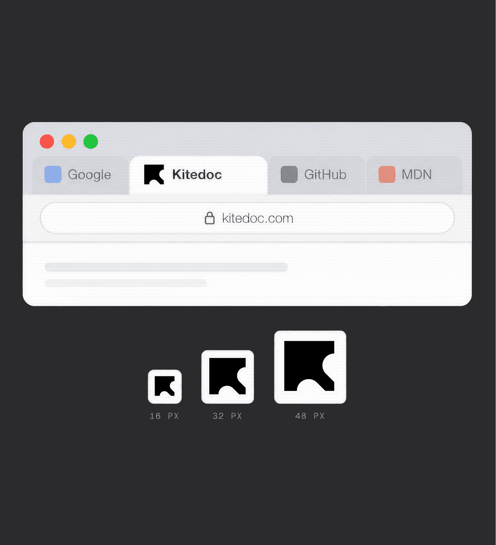
Kitedoc needed to feel professional and reliable, but not overbranded. A loud identity would have added production effort and could have competed with the product itself. A restrained brand made more sense for a tool built around sensitive documents, proposals and client facing workflows.
The identity uses a lowercase wordmark, a small geometric mark inspired by movement and sending, and a monochrome foundation that could extend naturally into the product interface.
This was not about creating a complete brand universe. It was about creating a quiet, credible layer that made the MVP feel trustworthy without slowing down validation.


PRODUCT SYSTEM
The product was where the restrained brand direction became a working system.
Kitedoc was not designed as a collection of separate tools. At the center of the experience is the document. A document can be shared, tracked, signed, protected and grouped inside a data room, while keeping its own activity, access rules, analytics and signing status.
This made the product challenge more complex than simply designing different screens. The interface needed to make connected workflows feel understandable without exposing too much of the underlying complexity.
The product response was based on architecture, reuse and clarity. Instead of creating a different experience for every action, Kitedoc was designed around a shared structure that could support the same document across different contexts.
The document became the core object of the entire system.
Sharing, analytics, signing, permissions and data rooms were designed as different states and contexts of that object rather than separate workflows. A data room could contain multiple documents, each with its own views, permissions, signature status and activity. A signed document could still be tracked. A shared document could still belong to a larger room. Analytics could live at document level and room level.
This architecture helped reduce complexity. Instead of treating each capability as a separate workflow, the product made them feel like different states and contexts of the same document system.
The result was a product that could support multiple use cases without feeling like a collection of disconnected tools.

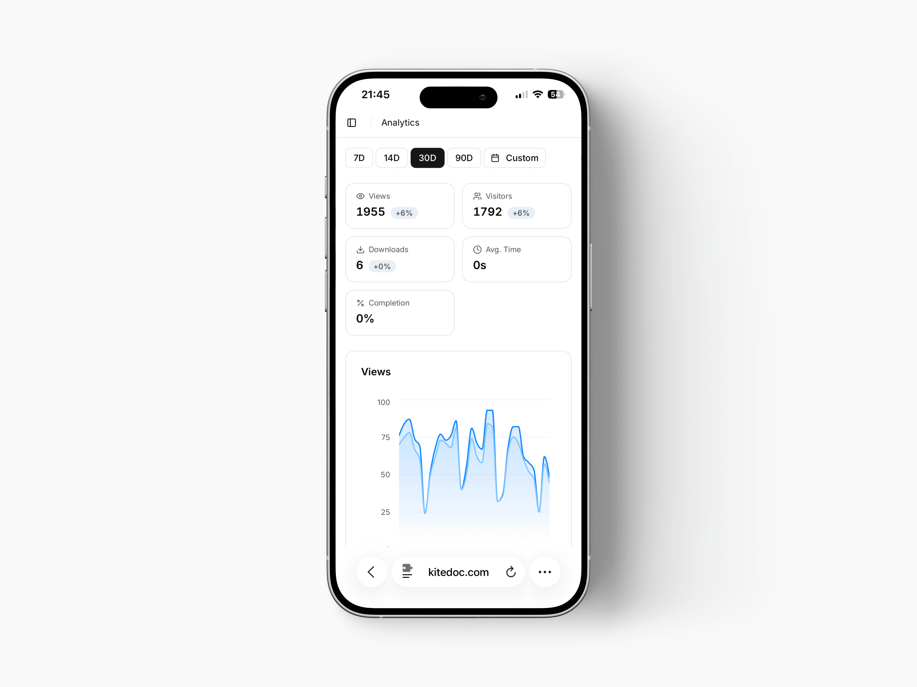
The interface system translated that architecture into reusable UI patterns.
Because the same document could appear in different contexts, the product needed components that could travel across the experience. Cards, tables, badges, activity items, analytics modules and action areas were designed to feel consistent whether they appeared in a library, a viewer, a data room, a signing state or an analytics view.
The visual language stayed deliberately restrained. A monochrome base, generous spacing, thin borders and clear hierarchy helped reduce visual noise. Blue was reserved mainly for analytics and data visualization, while status colors were used only when they carried meaning, such as signed, completed, active or voided.
This approach supported the MVP constraint. Fewer visual rules meant fewer decisions, faster implementation and a more coherent product. The MVP could feel mature through consistency rather than unnecessary detail.

Trust was built through clarity, not visual complexity.
Because Kitedoc handles sensitive business documents, users needed to understand what was happening at every moment: where a document lived, who had access, whether it had been viewed, whether it required a signature and what action was available next.
The interface avoids unnecessary decoration so those relationships can stay readable. Clear statuses, visible actions, activity trails, analytics modules and consistent feedback help users feel in control of a system that could otherwise become complex very quickly.
The product did not create trust by making the interface look heavy. It created trust by making connected information easy to understand.
The marketing website extended the same product language into a communication surface.
Instead of creating a separate promotional style, real product components became the foundation of the website. This kept the promise close to the actual product experience and reduced the amount of extra design work needed to launch.
At the same time, the website needed to explain the product faster than the app itself. Supporting visuals, simplified UI compositions and marketing sections were added to make the value proposition easier to understand without breaking the product language.
The tradeoff was intentional. A more expressive website could have looked more polished in isolation, but it would have taken longer to produce and created a gap between marketing and product. For an MVP, coherence and speed were more valuable than spectacle.
The result was a website that felt connected to the app, but still worked as a sales and validation tool.
collaboration
The lean approach also shaped the way the product was designed and built.
Design and development happened in parallel, without a traditional handoff. Product decisions, interface decisions and technical constraints were discussed continuously throughout the build.
This made the system more practical. Components were not only designed to look consistent, but to be reusable across the product and marketing website. Design decisions were judged by how much trust they created, how clearly they communicated and how quickly they could be implemented.
The result was a product language built for execution, not only presentation.
conclusion
Kitedoc explored how much trust and clarity a B2B product needs before it earns the right to scale.
The project combined branding, architecture, UX and interface design into a single system designed for validation rather than growth.
More importantly, it reinforced a principle that continues to shape my work today: complexity doesn’t need to be hidden. It needs to be structured.
Polished enough to build confidence. Lean enough to validate fast.