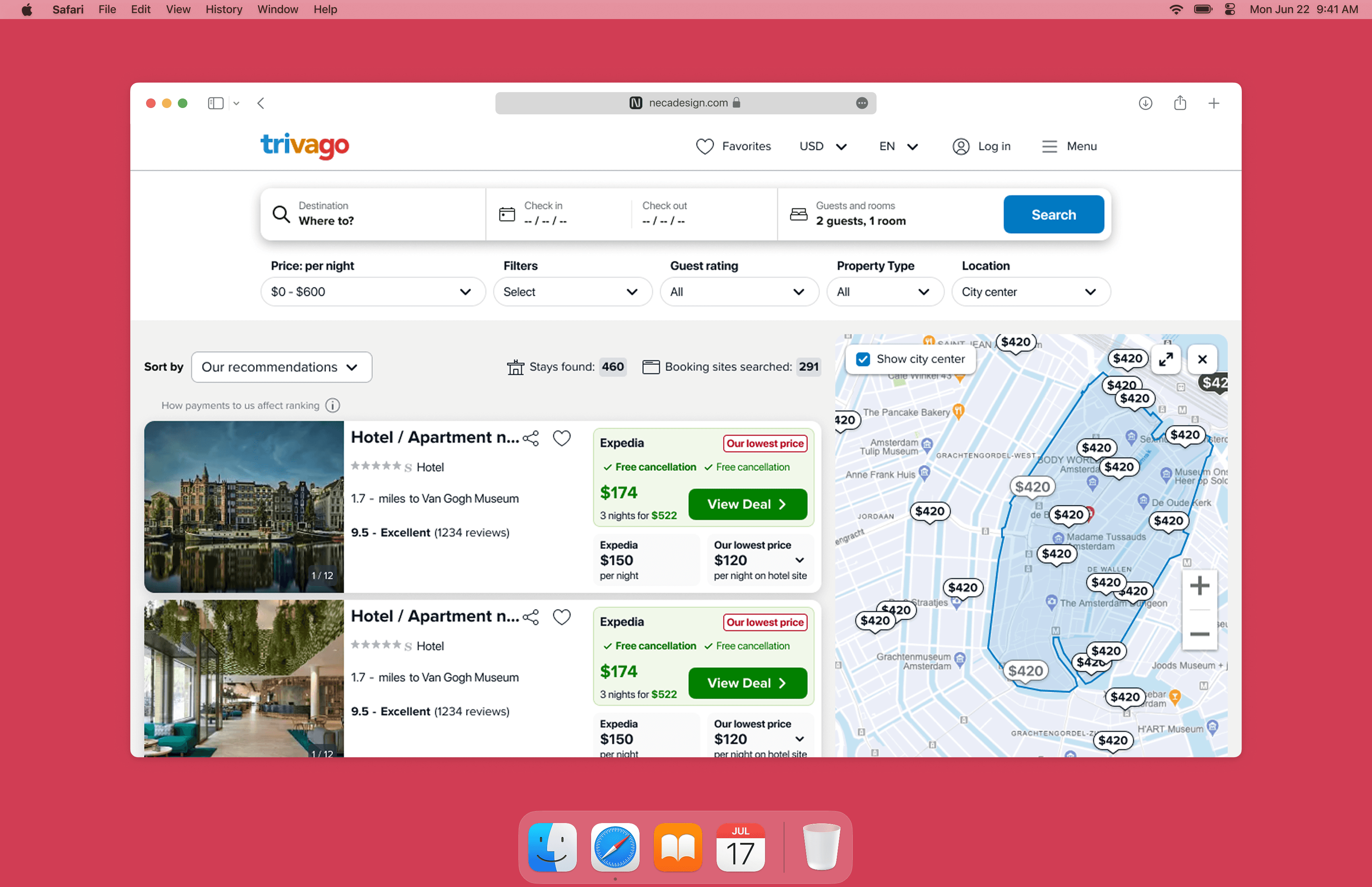
app icons
Small visual objects designed to make each product instantly recognizable.


Each icon starts from the same question: what should the product feel like before someone opens it? Instead of treating app icons as decorative logos, I design them as small product objects shaped by the app’s purpose, category and desired perception.
dion media player
The product
Dion is a media player designed to bring different content sources into one polished experience. The icon needed to communicate video, quality and familiarity before the app was even opened.
Challenge & direction
The goal was to avoid the usual media app language: play buttons, flat screens and generic playback symbols. I decided to build the icon around a modernized classic television, turning a familiar object into something more refined, digital and memorable.
Instead of placing a logo inside the app icon shape, the shape itself became the object. The rounded corners of the App Store icon were used as part of the television silhouette, allowing the design to occupy the full canvas and feel more native to the platform.

final design
The final design uses a strong silhouette, high contrast and the recognizable color bars of a television test screen to remain clear at small sizes. Rounded geometry, subtle depth and polished materials help modernize the classic reference, while the full-canvas composition turns the icon into a small brand object rather than a logo placed inside a frame.


pomma
The product
Pomma is an erotic wellbeing app designed to help women reconnect with desire through audio, stories and guided exploration. The product is not designed as pure entertainment, but as a softer way for women to reconnect with their body, desire and personal rhythm.
Challenge & direction
The challenge wasn’t visibility. It was comfort. For a product in this category, the app icon lives in a very public surface: the phone home screen. The icon lives in a highly public space: the home screen. It needed to feel private, calm and comfortable to keep alongside any other wellness, health or lifestyle app.
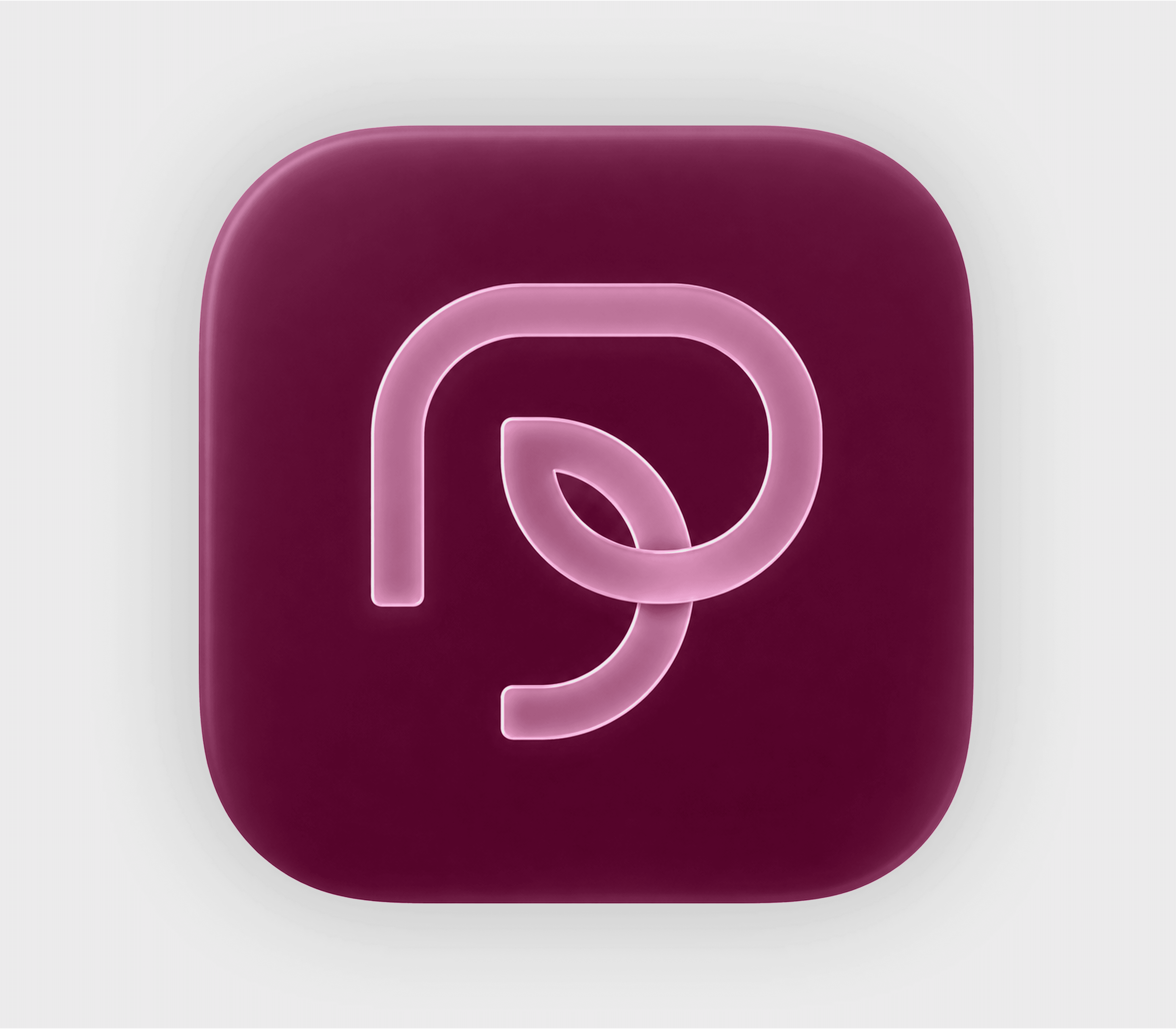
Rather than competing for attention, the icon was designed to feel native to the platform. Simple geometry, restrained materials and familiar proportions help it blend naturally into the Apple ecosystem while remaining recognisable through its fruit-inspired silhouette.

final design
The final design balances familiarity and distinction.
The fruit-inspired silhouette gives the icon an instantly recognizable shape, while the soft glass treatment and warm palette create a calmer, more approachable presence.
The symbol carries a second reading: when rotated, the leaf and stem resolve into a heart-like form, introducing a subtle reference to self-care and emotional wellbeing without becoming overly literal.
Rather than signalling the category directly, the icon focuses on emotion and perception, helping the product feel private, premium and naturally at home within the broader wellness ecosystem.